Subscribe to receive top agriculture news
Be informed daily with these free e-newsletters

Knowing how your fields compare to U.S. averages provides perspective for marketing.

Corn and soybean prices continued their downward spiral last week. While most of the selling pressure came in old crop contracts, December corn traded below $5 and November soybeans broke the $12 barrier for the first time since the end of 2021.
Selling pressuring into the end of May isn’t unusual – it’s the trend on average over the past 50 years. Without serious planting delays for adverse weather forecasts, the path of least resistance is lower ahead of summer’s start.
USDA’s Crop Progress updates released at the beginning of the trading week should begin to feature condition reports for corn soon, with soybean ratings following in short order. These first reports typically show around 65% of the fields in good or excellent condition, and if that history repeats, buyers may continue to sit on their hands.
Judging plants that are barely out of the ground may seem as useful as beauty pageants for newborns, especially if your own fields look like a bad barber college haircut. But traders follow these reports, in part because there’s not much else to go this early in the growing season. And, as I wrote about recently, it’s important to guard against “my backyard syndrome” – applying your own conditions to the national crop as a whole.
So how good is your own view out the back door? One way to tell is to compare your yields to national averages published by USDA, which can be found with the National Agricultural Statistics Service’s Quick Stats online database tool.
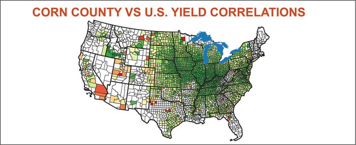
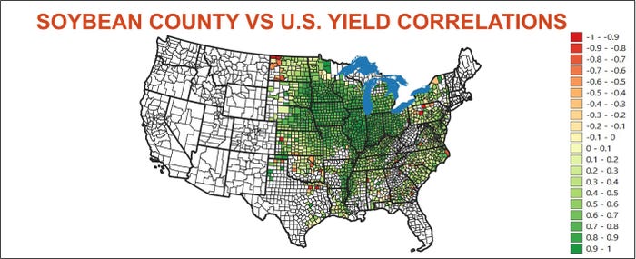
Growers who farm around the heart of the Midwest likely match the national yield fairly closely. To find out, I figured correlations between NASS county yields and the U.S. average from 2003 through 2022. Results for both crops are show on the maps below. The darker the green, the more closely a county yield tracks the U.S. average.
Correlation is a statistical measurement comparing two variables, in this case, the yield for a county to the U.S. average. I used what’s known as a linear equation, which calculates the constant rate at which both variables change.
A “scattergram” chart in Excel for this plots the trendline showing how yields could be expected to change. The scattergram below compares McLean County, IL yields to the U.S. average over 2003-2022. Each year is represented by a dot at the intersection of the U.S. axis on the left and the McLean County axis along the bottom.
In this example the dots are bunched fairly close together along the trendline, suggesting a fairly strong correlation – .91. The relationship is positive. That is, as the U.S. yield goes up, the McLean County yield could also be expected to go up.
Instead of rising from left to right, the line could fall. This would indicate a negative correlation – as U.S. yields rise, the county yield could be expected to decline. This is fairly rare, though is seems to be happening more often recently, perhaps due to increasing weather variability around the country.

Correlations and linear analysis are the bread and butter for those who analyze supply and demand to forecast prices. The symbol for correlation is R, and economists often refer to R-squared, or R2 (R times R). But what do these numbers mean?
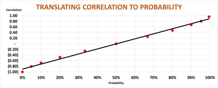
Translating the statistics into a more understandable format isn’t easy, but some approximations can be made. Correlations range from 1 to -1. A perfect positive correlation is 1, while its opposite negative statistic is -1. So, you can think of 1 as being a 100% probability, with 0% probability at a -1 correlation.
In the middle of the range is a correlation of zero, neither positive nor negative. In probability terms, this means 50-50 odds – a tossup.
A .91 correlation like the one for McLean County, IL corn, doesn’t mean a 91% probability however. The probability is even higher – 98%, or very strong odds of 55 to 1. A correlation of .81 translates into odds of 20 to1, or a probability of 95%.
On the flip side, negative correlations mean the probability of a county matching the U.S. yield are low. The chart below provides a rough guide on what a correlation means in terms of probability.
Before trying find an online gambling site for a prop bet on your county’s yield, some caveats about these numbers.
First off, complete NASS yield data for the 20 years covered is only currently available for around 25% of U.S. crop-producing counties, and even some in the big states like Illinois are missing individual years. Missing data is also more prevalent further out on the fringes of the growing regions. However, maps using only the complete data sets appear to match those that include missing data.
Second, even the strongest correlations are subject to error. In the case of McLean County, IL corn, for example, this error amounts to nearly 6%, plus orminus, or more than 12 bushels per acre either way from the county’s forecast “normal” yield for 2023.
And, if the correlation between county and U.S. yields is indeed decreasing, that error could be even greater.
Finally, of course, your yield may vary a lot from your county’s. Taking the time to determine this correlation for your farm is useful on a number of other fronts, too, including planning for ARC-County farm program payments or county-level crop insurance products.
To be sure, it’s a lot of numbers. But knowing how they work for your farm can help you gain much-needed perspective for what looks like a challenging marketing campaign.
Knorr writes from Chicago, Ill. Email him at [email protected].
The opinions of the author are not necessarily those of Farm Futures or Farm Progress.
You May Also Like
Enter a zip code to see the weather conditions for a different location.