Subscribe to receive top agriculture news
Be informed daily with these free e-newsletters

Both corn and soybean production is relatively concentrated in the Corn Belt, Upper Midwest, parts of the Great Plains and the Mississippi River Region. In some senses, the relatively small region that accounts for most of the production may be surprising. Obviously, production changes in these regions will have large impacts on total U.S. production.
July 9, 2013
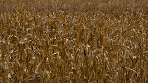
As is well known, corn and soybean production is concentrated in the Corn Belt, with significant amounts of production occurring in the Upper Midwest, parts of the Great Plains and down the Mississippi River.
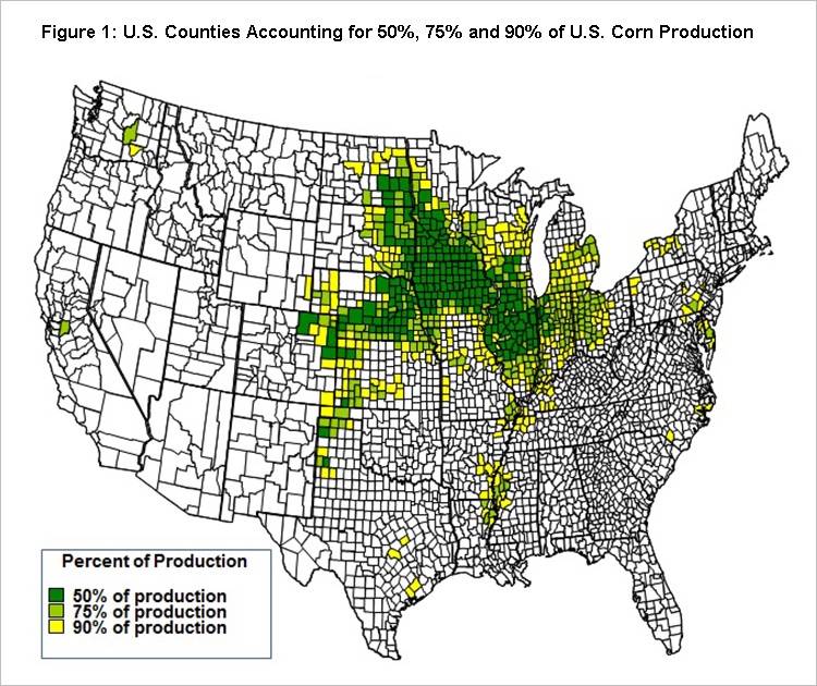
Corn Concentration
In the U.S., 50% of the corn is produced in the 220 counties with the largest production. These counties are predominately located center of the Corn Belt (see map). States in the Corn Belt with counties in the top 50% of production include Iowa (66 counties), Illinois (43 counties), Minnesota (37 counties), Nebraska (35 counties), South Dakota (11 counties), Indiana (7 counties) and North Dakota (6 counties). Other states that have counties in the 220 include Wisconsin (6 counties), Texas (2 counties), Kansas (3 counties), Colorado (3 counties) and Missouri (1 county).

Seventy-five percent of U.S. production is produced in 456 counties, the above 220 counties plus 236 more counties. These 456 counties are predominately in the Corn Belt. In addition to the states with counties that account for 50% of production, additional states with counties in 75% of U.S. production include Ohio (27 counties), Michigan (12 counties), Mississippi (3 counties), Louisiana (3 counties), Washington (1 county), Pennsylvania (1 county), Oklahoma (1 county), Kentucky (1 county), Delaware (1 county) and California (1 county).
Like what you're reading? Subscribe to CSD Extra and get the latest news right to your inbox!
Adding the next 297 largest counties in terms of production yields 90% of total production. Most of these counties still are in the Corn Belt. Additional states not listed above with counties contributing to 90% of total U.S. production include North Carolina and New York.
As one would expect, most of the U.S. corn is produced in and on the periphery of the Corn Belt. Other area contributing sizable amounts to total production include the western Great Plains (western Nebraska, western Kansas, eastern Colorado and the panhandles of Oklahoma and Texas) and the Mississippi River Delta (Mississippi, Louisiana, and Arkansas).
Soybean production has about the same concentration as corn. To arrive at 50% of total U.S. production it takes 256 counties for soybeans, compared to 220 counties for corn. To arrive at 75% of total U.S. production, it takes 486 counties for soybeans, compared to 456 for corn. To arrive at 90% of total U.S. production, it takes 743 counties for soybeans, compared 753 counties for corn.
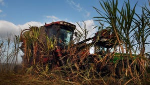
The soybean production region has similarities to corn (see map). Most of U.S. production can be accounted for beginning in the Upper Midwest (North Dakota and Minnesota), coming through the Corn Belt and periphery states (South Dakota, Wisconsin, Iowa, Missouri, Illinois, Indiana, Michigan and Ohio) and down the Mississippi River (Missouri, Kentucky, Arkansas, Tennessee, Mississippi and Louisiana). Compared to corn, more soybean production occurs around the Mississippi River and less in the western Great Plains.

Concentration is examined for both corn and soybeans. The following describes methods for corn. The same procedures were used for soybeans.
Total corn production by county came from the National Agricultural Statistical Service (NASS) for 2010, 2011 and 2012. These three years were averaged to arrive at average production for each county in the U.S.
Based on the 2010-2012 average, counties were ranked ordered from highest to lowest production. Then, production totals were calculated for successively more counties. For example, production from the first- and second-largest counties was added together to arrive at production from the two largest counties. Then, production from the three largest counties was added together to arrive at production for the three largest producing counties. This process was repeated until the total from the largest counties just exceeded 50% of total U.S. production from 2010 to 2012. These largest counties then accounted for 50% of total U.S. production. The resulting 220 counties for corn are denoted as dark green on the charts on the previous pages.
The above process was repeated to find the largest counties accounting for 75% of production. The resulting 456 counties include the dark green counties representing 50% of total production plus the light green counties. The process was repeated for 90% of total U.S. production. The resulting 753 counties are denoted by dark green, light green and yellow.
The procedure results in the lowest number of counties that account for the specified level of U.S. total production. It does not attempt to control for size of county. The procedure may have a bias for counties with more acres. A procedure holding acreage constant could result in a different map to the one shown in Figure 1. However, large differences from that shown in Figure 1 are not likely.
Read the article at farmdocDaily.
You might also like:
Should you be Selling Soybeans?
Wet Soils Affect Corn Roots, Nitrogen Uptake
POLL: Should the Nutrition Title be separated from the farm bill?
You May Also Like
Enter a zip code to see the weather conditions for a different location.