October 1, 2018

I don’t like it when people generalize about the characteristics of a demographic group – like when people say “bald men are better looking”. There are always exceptions that make those generalizations flawed.
But as much as I dislike generalizations, I’ll offer this one – “most ag lenders are not trained to be agronomic advisors.” In many cases, ag lenders may be doing exactly that—making agronomic decisions by limiting input investments with a maximum per-acre budget. While your lender may not be an agronomist, there is a fairly good chance that he or she is a “numbers person”.
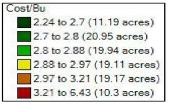
This field is an example—the map shows breakeven cost/bu. with a field average of $2.88/bu. That breakeven wasn’t achieved by treating the entire field as though it had the same potential.

This is where your data can help. Can you use your data, and specifically your agronomic numbers, to your advantage? Can you use your maps to tell a story of how you make the very best input investments? Can you use your data to explain that while flat rate applications/seeding rates are easy to budget, they are flawed agronomically and economically?

These yield-driven nutrient removal charts show how higher yields remove more nutrients in the most productive areas and less in poorer yielding areas—proving how flat rate nutrient applications represent over spending and under spending.
As you can see in the average production costs charts, flat rates equate to spending too much on seed and nutrients in the less productive areas of fields (yellow,red), and frequently far too little in the most productive areas (green). Why continue to apply the same rate of nutrients to every acre, when you don’t remove the same rate through yield?
Investing your input dollars to maximize your return on investment is all about where you invest within each zone of your fields!!! It’s time to use your data to tell lenders the story of how the best agronomics are also the best economics!

About the Author(s)
You May Also Like


