Subscribe to receive top agriculture news
Be informed daily with these free e-newsletters

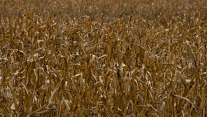
Here's how to use different types of field maps to diagnose issues in corn.

So, you want to grow more corn per acre. That means capturing more solar energy. You need a uniform “factory” that can operate without stress and use photosynthesis to turn energy into plant food all season.
“Yield-limiting factors can get in the way,” says Bob Nielsen, Purdue University Extension corn specialist. “You need to identify what those yield-limiting factors are before you can move toward higher yields.”
Various types of field maps can help identify areas in any given year that don’t reach their full yield potential. These same maps can help sort out possible causes. Here’s a closer look:
As-applied maps. These are computer maps your equipment can make if you have GPS and the proper software. You may have as-applied maps for planting, nitrogen applications, fertilizer applications and spraying.
“These maps can help pinpoint equipment issues which occurred during application,” Nielsen says. For example, suppose you applied liquid nitrogen as sidedress, or even at V10. If you look at the map and notice some areas within certain passes show a different color, meaning a different rate, you know there was a problem with equipment, he notes. Perhaps a nozzle plugged.
If you catch it while applying, you can correct the issue. If you see it on maps after the fact, you can watch those areas to see if plant health maps and yield maps mirror the as-applied map.
Yield maps. “These can be road maps to problem areas within a field,” Nielsen says. “What a yield map can do is help you focus on areas which aren’t performing as well.”
Is the issue poor drainage? Or low pH? Or low soil fertility? At least you know where to start looking.
For yield maps to be useful, calibrate yield monitors correctly, Nielsen insists. With most yield monitors, you need to recalibrate if moisture content changes drastically, or if you shift hybrids.
Aerial maps. These will likely be maps prepared by stitching images from unmanned aerial vehicle flights or plant health maps from those flights. Some services also use airplane flights or satellite imagery.
“Aerial images are often mirror images of yield maps,” Nielsen says. “Aerial maps can also be road maps to finding issues which limit yield.”

Nielsen believes aerial maps may have an advantage over yield maps if your goal is finding yield-limiting factors.
“You can spot problems earlier in the season than if you’re doing a postmortem with a field map,” he explains. “Maybe you can take corrective action, maybe not. You can at least do a better job of diagnosing the problem during the season.
“Plus, aerial images are in high resolution and may detect problems which you won’t see on a yield map.”
You May Also Like
Enter a zip code to see the weather conditions for a different location.