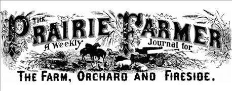
What's one of the most obvious differences as you study Prairie Farmer issues going back to 1841?
The masthead, which is what we call the design that encompasses the Prairie Farmer name at the top of every cover.
Says Lisa Lynd, content design director at Penton Agriculture, a magazine’s masthead should be a reflection of the identity of the publication. “Whether 1884 or 1976, Prairie Farmer’s typeface feels authoritative and trustworthy, reflecting the essential nature of our content to readers in farming communities across Illinois,” she adds.

175 YEARS: Celebrating Prairie Farmer, 1841-2016
In truth, a masthead is a magazine’s branding — and farm magazine mastheads were likely some of the first branding in U.S. agriculture, says Mike Wilson, Farm Futures editor and Prairie Farmer editor from 1991-2002.
“When you got the Prairie Farmer newspaper in 1878, you didn’t even read the title. You looked at the picture and knew what it was. That’s how branding works,” Wilson says.
Consider Time magazine and National Geographic, Wilson adds: Time has never changed its masthead, and National Geographic has always had a yellow border. “They have an iconic look,” he explains.
Mastheads, even at Prairie Farmer, are influenced by what is happening at that time. Wilson points to the 1980s-era masthead from when he began at the magazine. Its rounded letter font was modern and reflective of the computer age.
Lynd concurs. “The evolution of the masthead matches closely with advancements in technology that were happening all around us. The artwork will always be a reflection of an era, from horse-powered farming implements to Adobe’s InDesign software,” she explains.
Technology at work
As you look through the mastheads, Lynd says you’ll see the shift from black-and-white printing to color printing, which of course allowed for full-color photography to be featured on the covers. That evolution to color also helps explain the move you see from beautiful custom engravings to a more modern treatment, when technological developments in the printing industry made fonts more readily available.
In 1853, Prairie Farmer staff gave kudos to engraver R.N. White, Chicago, who illustrated the masthead, with this snippet:
“The cuts used in this volume of the Prairie Farmer are made by Mr. R.N. White of this city, whose card appears on our covers. They are not commonly of a kind in which the higher style of the art may be exhibited, but we have evidence that Mr. W. has few superiors of his craft in the United States; and we hope that he may receive suitable encouragement from those who have anything in this line to be done.”
Eventually, desktop publishing became more commonplace, and as Lynd notes, it became easier and less expensive to make changes to the masthead. That technology also allowed designers to place photography behind the masthead. Over the past 15 years, Prairie Farmer’s style gravitated to a white cover treatment, but during this past year, art directors and editors began layering photos in a full-bleed treatment again.
Stay tuned in January, when Prairie Farmer will introduce a new masthead, redesigned under Lynd’s direction, which will allow for a variety of photography styles and treatments on the cover — and will carry the Prairie Farmer brand into the future.
Here's a look back at mastheads from the past:

1840s

1850s (R.N. White design mentioned in article)

1850s

1860s

1880s

1890s

1910s

1920s
.jpg?width=600&auto=webp&quality=80&disable=upscale)
1930s

1940s

1950s

1970s
.jpg?width=600&auto=webp&quality=80&disable=upscale)
1980s

1990s

2000s

2016
About the Author(s)
You May Also Like


