President Trump’s signature on the Agriculture Improvement Act of 2018 barely had time to dry before the government shut down for a record 35 days in December and January. Delays implementing the 529-page farm bill mean farmers may not find out all the details of the new program for weeks, if not months. But with growers finalizing planting choices for spring it’s time to make some educated guesses before putting your own ink on marketing plans for 2019.
Depending on how fast the gears of government and the Extension Service turn, this may not be easy. But my initial analysis suggests the new law should raise the floor of support from the government for the average corn and soybean farmer. While the new system isn’t likely to guarantee anything close to a profit at today’s prices, it could at least make it a little easier to avoid selling for a loss – and regretting it later.
The law doesn’t make major changes to the program but tweaks some of the inequities that helped some farmers and hurt others. At first blush, corn growers appear to have more to cheer about than those planting soybeans, at least with the Agricultural Risk Coverage-County program chosen under the 2014 law on 93% of corn and 97% of soybean base acres. But the choice between ARC and the other major alternative, Price Loss Coverage, isn’t as clear-cut as it was five years ago. High prices from the commodity boom that preceded the 2014 law inflated ARC benchmark prices, which were significantly higher than the reference prices used in the PLC floor. Those reference prices, $8.40 for soybeans and $3.70 for corn, stayed the same in the new law, but are a lot closer to today’s market.
AIA also allows updated base yields, though they won’t take effect for PLC until the 2020 crop year. While this is a farm-by-farm decision, county-level analysis shows some areas more likely to benefit than others, depending in part of losses suffered in the 2012 drought year. Those in Illinois seem more likely to gain, than those in Iowa, for example.
Changes to ARC likewise don’t look evenly distributed, but they should help most on average. Benchmark yields for counties will use results farmers submit to the Risk Management Agency for crop insurance. This covers most fields, unlike yields used by the 2014 law, which mostly came from surveys done by USDA’s National Agricultural Statistics Service. RMA yields for both corn and soybeans on average run about 2% higher than NASS.
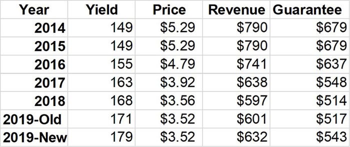
ARC’s benchmark also will use trend-adjusted yields, which take into account the statistical tendency for yields to increase over time. USDA is supposed to use trend-adjusted yield factors RMA develops for crop insurance. The law is vague on how this will be done. But if ARC uses a system similar to RMA’s it could add another 8 bushels per acre to the average 2019 benchmark corn yield, increasing the benchmark revenue guarantee $26 per acre, around 5%. Benchmark soybean yields would go up about a bushel, adding $8, or 2%, to the average revenue guarantee.
Another AIA change allows farmers to switch between ARC and PLC after the first two years of the program. Reference prices used for PLC can float up to 15% higher if the market rallies. That may seem unlikely now, but it could matter down the road.
Finally, the new law raises loan rates to $2.20 for corn and $6.20 for soybeans. While this drops the maximum payments under PLC, it lowers the cost of storage for growers who put inventory under loan.
So which is better, ARC or PLC? PLC protects against only low prices, not revenue losses from bad yields. So if average cash prices are below the reference price, PLC tends to pay more unless yields fall low enough to trigger revenue losses that favor ARC
But that’s the average. Crunch the numbers for your farm to find out. We have prepared county level maps to show how many of these changes could play out, based on our best guess about how rules may be written. But the law itself contains only a sentence or two about what USDA is supposed to do, so much could change by the time final regulations come out.
How to use the maps
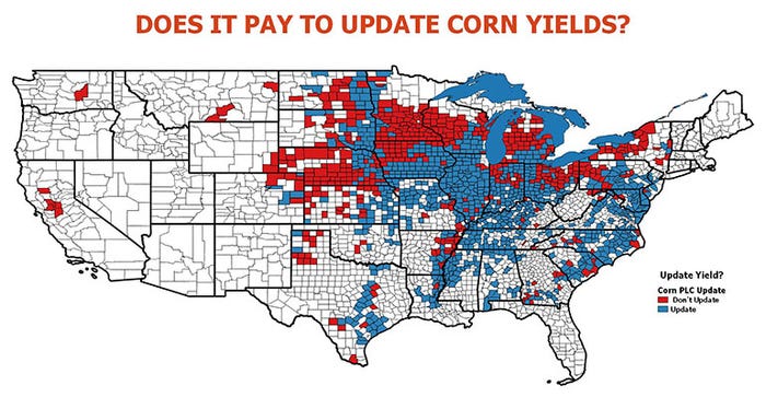
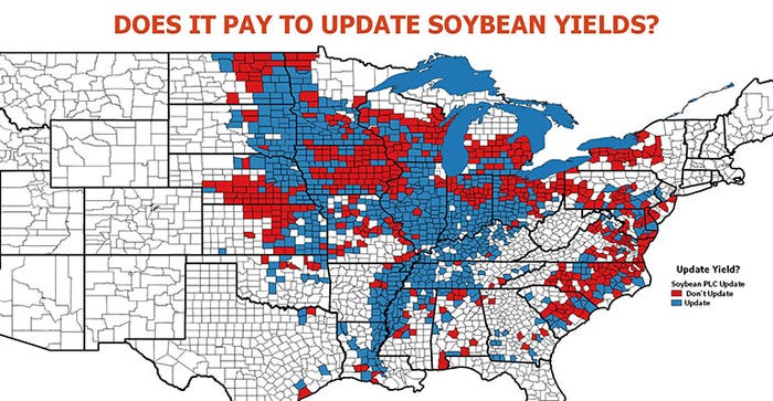
These maps show county-level data for three factors to consider for both corn and soybeans. For each decision for each crop, there are two maps. The top map provides an overview. The second inter-active Google Map lets you find the data for your county and cropping practice. Click the box in the upper left-hand corner of the Google Maps to bring up a legend, then click the box by the factor you want to look at. Hit the plus or minus sign on the bottom left-land corner of the map to move in or out. You can also do this with your mouse if using a computer. Click the circle by your county to pull up the data.
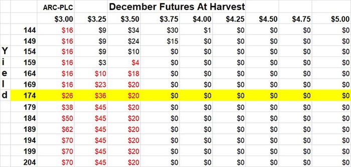
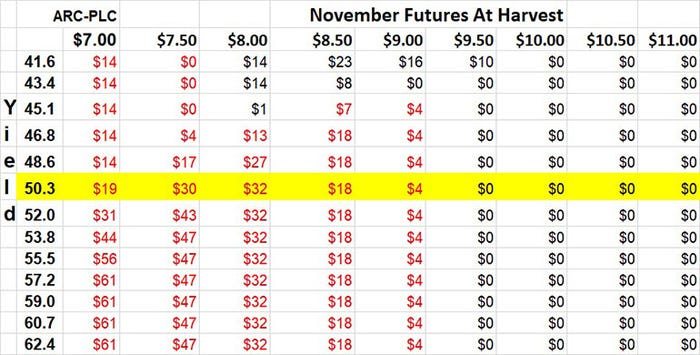
Finally, there are four more illustrations comparing the ARC vs PLC programs. These show the difference in the expected profit or loss per acre depending on the program chosen and the projected benchmark revenue guarantee under the old program and the new farm bill.
A word of caution. Projections made in this analysis is based on myriad assumptions about how the new system will be implemented. We will update the information as more complete details are known.
Factor 1: Updating base yields
Growers have an opportunity to update both base acres and yields. These are individual decisions tied to a field or farm. Our analysis uses county yield information to make projections for updating base yields. The top map for each crop compares the updated base yield for a county, using 2013-2017 county yields, to our projection of what the yield is if updated in 2014 using 2008-2012 county yields. Counties where the new yield is above the old yield are in blue. If not, the county is in red.
Click the interactive map to find out the ratio for a county, but remember, this is an average for the county and may not apply to an individual farm or field in that county.
Factor 2: Comparing RMA yields to NASS yields
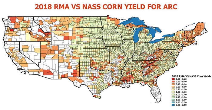
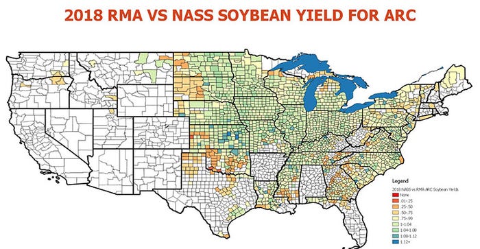
Under the new law, yields established by the Risk Management Agency are supposed to be used where possible in the ARC program. Currently, most counties are assigned a yield per planted acre develop by USDA’s National Agriculture Statistics Service. USDA prepared an analysis of how NASS yields compared to RMA yields. We’ve created both overview and interactive maps to present this data.
The maps show the ratio of the RMA yield to the NASS yield. If a ratio is more than 1, the RMA yield is higher than the NASS yield. If the ratio is less than 1, the RMA yield is lower. On average, the RMA yields appear to be about 2% higher for both corn and soybeans. The interactive maps show results for irrigated, non-irrigated and all yield types used in the ARC program.
Factor 3: Making a trend-yield adjustment
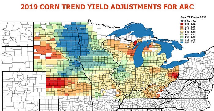
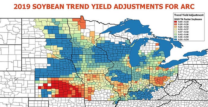
The new law says ARC yields will be based on trend-adjusted yields, which are used in some crop insurance products. If ARC yields are modified using the same system found in crop insurance, the five years of yields used to create the “Olympic” average for a county will be increased by the trend factor. The most recent yield would see an increase of 1 times the TA factor. The second most recent year would get an increase of 2 times the TA factor and so forth.
We have overview maps for these factors, as well as interactive maps that let you check the TA factor for a crop, including irrigated and non-irrigated fields.
However, it is unclear when 2018 county yield data will be released for making estimates for 2019 ARC benchmarks. USDA was scheduled to release NASS county yields Feb. 22 for corn and soybeans, but this will be affected by the government shutdown. RMA yields normally are not published until shortly before the end of the marketing year ends in August.
Factor 4: Comparing ARC vs PLC
Corn and soybean growers overwhelmingly chose ARC under the 2014 farm program. But years of low prices could make PLC attractive to some producers.
Based on nationwide averages, the new law adds $26, or 5% to the projected 2019 corn benchmark guarantee compared to the formula in the 2014 farm bill. The gain for soybeans is less, $8 an acre, or 2%. These figures assume yields with a trend-adjustment, using RMA data.
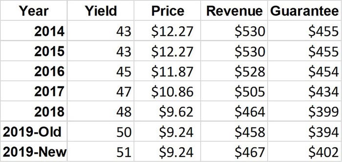
PLC coverage uses the same reference prices as the 2014 farm bill; these could float higher if prices rise. Growers updating base yields could also use those for 2020 and beyond. We compared ARC vs PLC, varying both yields and harvest prices to see how protection differs. The data tables below use projected average costs for corn and soybeans, along with projections for basis. Each cell in the data table shows the expected profit or loss from a combination of a yield and a harvest futures price. The yellow lines show the average yields we project for 2019 crops currently. The tables do not include updated base yields for PLC.
PLC pays off if average cash prices are below the reference price. This gives PLC an advantage over ARC until yields fall far enough make ARC’s revenue guarantees a factor.
About the Author(s)
You May Also Like


