Subscribe to receive top agriculture news
Be informed daily with these free e-newsletters

Drought is on the mind of many farmers and ranchers, but do you ever wonder who is making that declaration?
Since 1999, the National Drought Mitigation Center at the University of Nebraska-Lincoln, the National Oceanic and Atmospheric Administration, and USDA teamed up to create the U.S. Drought Monitor. It is a map of the entire country showing locations with minimal to exceptionally dry pockets. Creating this map is the job of a team of trained climatologists and meteorologists known as “authors” from all three entities.
Federal, state and local agencies rely on the U.S. Drought Monitor map to make disaster declarations. For instance, USDA uses it to determine a producer’s eligibility for certain drought assistance programs, such as the Livestock Forage Disaster Program and emergency haying or grazing on Conservation Reserve Program acres. The data is also used to “fast-track” secretarial drought disaster designations.
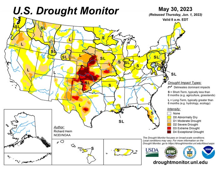
TRACKING DROUGHT: Farmers can view the entire country or click on their individual state to see drought conditions at the U.S. Drought Monitor website.
Here are five facts about the declaration process from the U.S. Drought Monitor:
1. There are five levels of intensity. The map looks at the entire country, identifying areas of drought using colors and labels. These include:
none = white
abnormally dry (D0) = yellow
moderate (D1) = tan
severe (D2) = orange
extreme (D3) = red
exceptional (D4) = brown
2. The U.S. Drought Monitor map uses more than precipitation data. Experts look at indicators beyond simply water, such as streamflow, reservoir levels, temperature and evaporative demand, soil moisture, and vegetation health. The final map considers all the data points. But it is more than just the statistics. Map authors also talk with experts across the country and use information about drought effects from media and the public.
3. A person updates the map. The Drought Monitor map is released every Thursday, but it is not computer generated. Each week, a map author — a trained climatologist or meteorologist — processes and analyzes data to update it.
4. The Drought Monitor provides a current snapshot, not a forecast. The map is a glimpse in time of drought conditions during the most recent week. It uses only data for the week that ended the preceding Tuesday, so it does not include rain that falls on Wednesday before the release. The rationale: It provides a consistent, week‐to‐week product and gives the author a window to assess the data and produce a final map.
5. You can be part of the drought-monitoring process. Farmers can contact the author to share if drought conditions are worse in their area than what the Drought Monitor shows. Often this information prompts a closer look at all available data for that specific area, to see whether measurements of precipitation, temperature, soil moisture and other indicators verify farmer-submitted reports. It is simple to file a report via Condition Monitoring Observer Reports. There is even a QR code on the page to scan.
For more information on the U.S. Drought Monitor, visit the website.
You May Also Like
Enter a zip code to see the weather conditions for a different location.